With Samsung, LG, and Apple (probably) going tall and narrow, the future of phone design is clear.
We all recognize that the average smartphone has gotten bigger, but few of us recall that they also used to be shaped differently. The original iPhone in 2007 had a 3:2 display with a resolution of only 480×320! Even when Apple introduced the first “retina” display with the iPhone 4 in 2010, the display aspect ratio remained 3:2. Android phones started off with a squat screen, too. 3:2 is fine for some things, but it’s a legacy that doesn’t make a lot of sense in a pocket device. The change to 16:9 took a few years; Apple took the leap with the iPhone 5 in 2012, Android devices just slightly earlier.
That was a sensible change. It made the phone taller without being wider, giving you more display area to look at while not making the phone harder to hold. It mirrored the common resolution of HDTVs and most hi-def video sources, so it was easy to watch videos that exactly filled the display.
Soon, 16:9 will be done for. As phones have grown bigger, it has become clear that 16:9 isn’t the best way to build a phone. Taller, narrower phones are here, and they’re here to stay.
2:1-ish display with slim bezels
Think about how you use your phone. We spend most of our time using apps and services that are essentially vertically scrolling lists of rich text and images. Twitter, Facebook, email, most web pages… we hold our phones in one hand, scroll up and down with our thumbs, and tap on stuff. We’re so averse to turning our phones sideways that vertical video has become a thing.

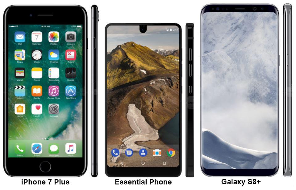
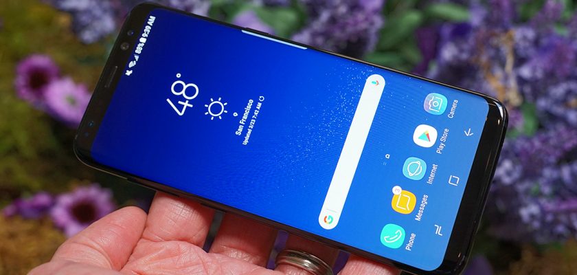
Look how absurd the iPhone 7 Plus looks next to those brand new Android phones. Andy Rubin’s new Essential Phone (shipping this summer) has a display just as wide as Apple’s and a bit taller, but the phone is dramatically smaller. Samsung’s Galaxy S8+ has a whopping 6.2-inch display that makes the iPhone’s look tiny, while the body size is nearly identical. The LG G6 (not pictured) has a similar aspect ratio and slim bezels, too.
Apple and other Android phone makers look almost comically old-fashioned. What’s with all that area above and below the display? What do they need that for? A company with such forward-thinking design now seems years out of date.
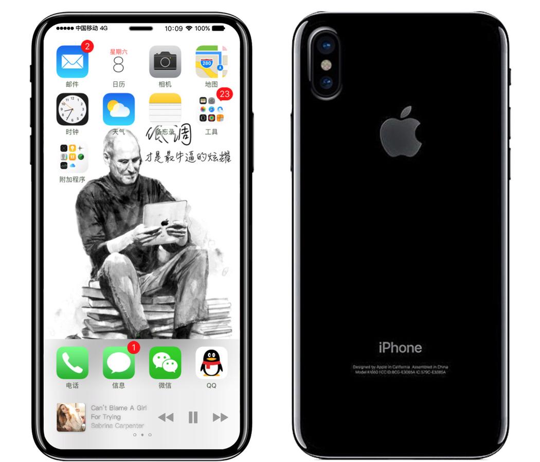
It probably won’t last long. There are no shortage of rumors about the forthcoming iPhone 8, and many of them contradict each other. One place where they all agree: Apple will move to a taller aspect ratio (around 2:1), with narrower bezels surrounding the display. The giant “forehead and chin” above and below the display will be drastically reduced or eliminated.
There are challenges with making this work. Apple’s home button and Touch ID sensor need to either move to the back (as is common with Android phones) or somehow be embedded under the display. But the benefits are worth it. A taller, narrower phone with slim bezels has the same capacity for one-hand use and the same pocket-ability while giving you dramatically more to interact with.
When holding the phone horizontally to capture photos or video, or playing a game, you can have a 16:9 or 3:2 view area with plenty of room on the sides for controls and info, visible but no longer obscuring your view. Having used both the LG G6 and Galaxy S8 extensively, I can say that 16:9 phones legitimately feel weird now. It’s just a worse experience overall.
And if Apple goes to a 2:1-ish screen ratio, and Samsung already has, then our fate as consumers is sealed. Everyone will follow suit. Those two companies represent such an overwhelming percentage of all premium phones that developer support is assured, and the design trend will be set for the next several years.
A few years ago, many tablets were shipped with an aspect ratio close to 16:9. The argument was that people watched video on their tablets, and video was 16:9. The Amazon Kindle Fire, Google Nexus 7, Barnes & Noble Nook…all “widescreen” tablets. Apple steadfastly stuck to at 4:3 ratio, smartly recognizing that the 16:9 ratio wasn’t a good fit for printed-page analogues and full-featured websites. For the way people use tablets, it was all wrong. Apple was right, and today, nearly all tablets have ratios around 4:3 to 3:2. In the same way, I feel that we’ll soon realize that the 16:9 ratio was never really the right fit for a one-hand computer we stick in our pockets.
Thanks: Motherboard


