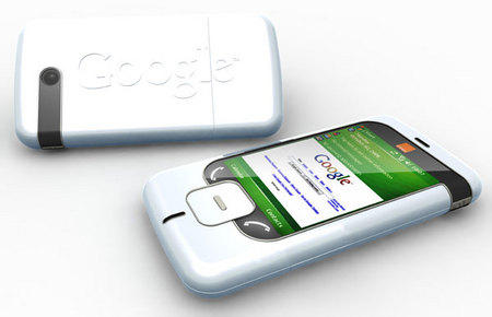
Expecting cool designs from the house of Google was never on the list. Looking at the past trends of the designing features, incorporated by Google in Gmail services and Google Docs, it has though never been exceptional in nature. They are functionally outstanding, but they don’t stand a chance, where design is concerned. The first attempt, by this giant, towards designing for mobiles was also in the dump. The initial attempts at Android weren’t impressive either and the company’s shot at designing dedicated mobile apps fell flat too.
The giant’s changed its gray areas though recently and has been laying stress on the design factor as well. Check out the latest from the brand and you will be astonished to see that the latest apps, including the latest version of Currents, the new Youtube app, Google+ for mobile, Gmail for iOS and the much in demand Google Maps for iOS, have all been subtle and impressive in their designs.
Kudos to the company to finally break the shackles and come of age. Together with this, the company is keen on introducing its own design language that will make the new apps a direct recognition in the market, coming from the house of Google. Recent trends in the designing pattern make use of the “cards” look which Google had first introduced with Google Now and the Google+app. Currents for Android has them incorporated, the new YouTube app has them and there are speculations of it being present in the latest Maps for iOS as well. The sombre animations of Google+ app are not present though, but the overall presentation is the same.

Google was never in the race to design skeuomorphic designs, as compared to Apple, and it opts for more minimal designs which are lucrative as well as have a functional approach. Designs which go over the top and use fake bookshelves or leather binders will be hardly present in the design features of Google, even in the near future.
Going by the recent developments and the urge to fight in the survival of the fittest, Google Maps for iOS give an indication of what might be in the pipeline, for the next set of apps. They are loaded with features that can swipe you off the floor. For example, swipe gestures hide some of the awesome functionality’s within. Even in navigation mode, a right-to-left swipe helps you preview the next turn in line. Searches made for your desired location can be easily viewed by simply swiping up from the info box at the bottom of the screen. They are not earmarked, but Google loves to play with the imagination prowess of the users mind and leaves it upto you to explore and get baffled.
Easier said than done, it is still an uphill task for Google when it comes to improvements, for designs on mobiles. Overall you can though not miss to give credits for the new features added in the design pattern. The efforts of the designers have finally paid off and the giant is still in the race to outperform its competitors.


Re-invention is the flavor to succeed. The more you experiment, the more you tend to innovate and explore. Google has finally found its place and is about to make a mark in the design development for mobiles.
Just waiting to see what Apple’s iOS Maps have to offer..!