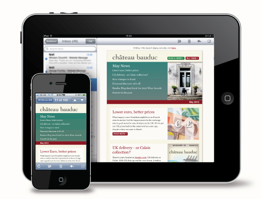
If you have kept your eyes and ears open, you wouldn’t have missed the omnipresent talks about responsive emails. What are these responsive emails? If you are good at deciphering the underlying meaning of a term’s name, you would know that this has to do with the responsiveness of an email. While the concept of Responsiveness is being extensively explored in the world of website designing, it is just making its debut with emails.
So, why is the concept of responsiveness making so much noise? This is because people, all over the world, are increasingly getting mobile. With the advent of the smart phones, people are preferring to access their emails and surf the internet via their mobile devices. This can also include the tablet computers which are posing a serious threat to laptops. In that case, if your email is not optimized for the mobile screens, its viewing experience will be extremely displeasing, and that will mean that you are losing customers. Let us delve into some statistics. It is said that about two thirds of the Americans will close or delete an email which is not optimized for their mobile screens. This could be justified by the fact that over 1/3rd of such emails are being opened on mobile devices. Responsive designs will ensure that your email precisely fits into the screen, and hence enhances the viewing experience.
There are an increasing number of times when Responsive designing is confused with scalable designing. While both work towards the same goals, their inherent concepts are quite different. Following are a few of their differences:
Highlights of Contents
Media Query
Scalable designs do not make use of Media Query, while the responsive designs do the same quite extensively. Basically, such CSS media query is a set of instruction which can be given to your email in order to switch to the mobile version of the email if the screen width is below 480 px. That is not the case with scalable designs. It has just one layout which moulds itself according to the screen size.

Scalability Model
The core difference, actually, lies in the way these two adjust to the devices. Scalable designing prepares one design only which adjusts to the screen’s size. Therefore, it gets larger for larger screens, and shrinks its size to fit into mobile devices’ screen space. While this seems good, the problem is the fact that the images and other text could get increasingly shrunk in this case. On the other hand, responsive designing is about coming up with two layouts. For all those devices which are above 480 px, the desktop version of the email is presented, and for those which are below this width, the 320 px wide version of the same is put forward. While this is a complicated procedure, it definitely brings about a considerable escalation in the site’s look and feel.
Therefore, responsive designs seems to be the better choice for you, in case your emails are image heavy and have a lot of text. In other words, responsive designing of emails ensures that you are not required to compromise on your email’s appeal, even when it is viewed on the mobile device.