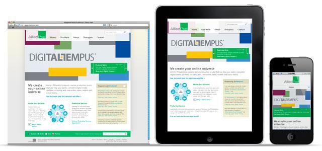
Responsive web design, or RWD as it is popularly known, is a new way to website creation. Using fluid grid technology, this technique adjusts the website’s design and layout as well as the functionality according to the dimensions of the device.
In a nutshell, this technology can understand which type of device are you using, like desktop computer, laptop, tablet or mobile, and can reallocate the element’s relative positions to fit properly into your device. Thus, the overall appearance of the website is preserved.
As many websites were not coded for this, the programmers were struggling to please the customers who come from different devices and like the best user experience possible.
The RWD solution is very appealing because a company need to build and manage only one website. This fact has earned RWD such a huge fan following. Recently Pete Cashmore, CEO of mashable.com, explained why they have shifted for RWD as well. That voice isn’t alone as many other webmasters and thought leaders alike are echoing the same belief. There are lots of case studies readily available to show how RWD is helping companies to cope up with the plethora of devices.
RWD, like every other radical change, has its followers and haters. People who love it claim that it is the present and future of web designing, this is the way every website should be built, this is how we can serve every purpose without building a site for every purpose. They claim it should become a standard practice.
The opponents, however, tell a different story. They point out the difficulties RWD has in implementation. There are many important drawbacks which RWD has must be considered and thus RWD can’t be the cure-all medicine for the web development related needs of present age.
We can discuss both side of the story and determine how much water which side holds.
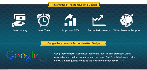
The most popular advantage of RWD is, as cited by many supporters, that you can build one website and serve almost every device under the sun. Be it a desktop PC a laptop, a Netbook an eBook reader, a tablet, a Smartphone or even a phablet, your site will load perfectly in every device. The site content, images, tables, navigation and other design element will have the effect of RWD and nobody needs to zoom or slide to get the total view of your site. If the user is happy, it is more probable that he will return to the site.
The other major advantage is you don’t need to put extra effort for each version of the website. It can be updated at one centralized place, like other normal websites, and the change will reflect on every format or version of the site. The same CMS you need to learn and its just one.
But alas! Nothing is perfect in this world. Thus, RWD has its own fair share of drawbacks as well. Let us present those too.
RWD fetches the same webpage elements to every device. However, depending on the device, the need of the user might be different. The mobile user of the site, who has at max 4 inches of display, might need a more concise version of the website. For example, when surfing a eCommerce site, the mobile users need to see the deals without much forewords, thus the promotions must be presented to him directly. However, RWD can’t do this easily, as of now.
RWD also performs poorly in page load time factor. As RWD loads all the images, tables and other heavy contents of a webpage without modifying or removing anything, in flaky mobile internet connection, it can make the page load really slow.
Responsive Web Design is also a process involving much cost, time and effort. You generally need to do a complete overhaul of the total existing site. A few lines of code can’t be injected to make a site responsive. Thus, it might take months to successfully build and launch a proper responsive site.
RWD is outright wrong choice for eCommerce portals. In case of ecom sites, it is better suited to build a mobile and tablet app. If you are bent on making a site, you should consider making a mobile version of the site.
Pushpendra Shukla works for IT Chimes and specializes in Website Structure and related activities. His present interest lies in E-Commerce & Responsive Websites Development. With an experience of half a decade in this industry, he is a known figure internationally and often shares his expertise, inputs and thoughts on various online platforms.


As with any business venture, it is of the utmost importance to do your research before deciding
to go in the business of web hosting reseller packages.
Dream – Host is an online hosting company that offers products like domain registration, shared website hosting,
Virtual Private Server (VPS), and public cloud services.
These connections and resource sharing can even be made across
different operating systems such as Unix, Linux and Microsoft Windows.
I used to be able to find good advice from yyour blog articles.
Thanks for sharing your thoughts on responsive web design.
Regards
I’m very happy tto discover this gredat site.
I wnt to to thank you for ones time due to this wonderful read!!
I definitely appreciated every bit oof it and i also have you saved as a favorite to
check out new information on your blog.
I thnk this is among the most significant information for me.
And i am glad reading your article. But wanna remark on some
general things, The site style is wonderful, the articles is really excellent : D.
Good job, cheers
I visited multiple web sites however thee audio
quality for aaudio songs presrnt aat this website is actually
fabulous.
Tremendous issues here. I’m very satisfied to look your post.
Thank you so much and I aam looking ahead to contact
you. Wiill you kindly drop me a mail?
I just couldn’t depart your website before suggesting that I actually loved the usual info a person supply
in your visitors? Is going to be again regularly in order to investigate cross-check new posts
Paragraph writing is also a fun, if you bbe familiar with then you can write or else it is difficult too write.
Here you will observe 82 stone bars engraved with the names of
graduates dating back as far as 1484. Here is an itineraly maybe
useful for your trip to Vietnam:. Especially in Vietnam,
one can see the blending of French and Vietnamese architecture, with a little Chinese influence thrown in too.
After looking at a number of the blog posts on your web page, I seriously like your technique of blogging.
I book-marked it to my bookmark site list and will be checking back in the near future.
Pleawse check out my web site as well and tell mee your opinion.
Hi, its nice post regarding media print, we all understand media
is a wonderful source of information.
It’s enormous that you are getting thoughts from this piece of writing as well as from our argument made at this place.
Thanks for sharing your thoughts on responsive web design. Regards
Your way of describing the whle thing in this artiicle is in fact pleasant, every one
can simply understand it, Thanks a lot.
The PAL Network is an organically advanced group of grounded activists and thought leaders across three
continents: Asia, Africa and Latin America.
Every weekend i used to pay a visit this web site, as i want enjoyment,
for the reason that this this website conations actually nice funny data too.
Companies say only disgruntled employees complain when their boss
abuses them.
Hi mates, how is the whole thing, and what you wish for
to say regarding this paragraph, in my view its genuinely amazing in favor of me.
Good post. I learn something totally new and challenging
on websites I stumbleupon every day. It’s always exciting to read through articles from other authors and use a little something from other web sites.
I was recommended this web site via my cousin. I’m now not positive whether or not this post is written through him as no
one else understand such particular about my problem.
You’re amazing! Thank you!