The first quarter of 2020 is over, and we’re now in the third quarter of the year. Despite the worldwide pandemic that continues to threaten all of us, the IT field continues to thrive, giving hope for those in the industry to continue working despite the numerous companies that closed due to the health crisis. Also, in terms of eCommerce development, we are witnessing various web design trends this year.
Web designers everywhere are experimenting on the various features for their website design, from color schemes, animations, typography, and shapes. Staying updated on the current trends is beneficial, regardless if you’re a novice designer, a pro, or a business owner who wants your website to flow with quality.
For eCommerce website development services, this is a huge plus when it comes to leaving an impression of reliability in the eyes of the clientele.
Do You know 6 Tips About Web Design That Affects Your Online Sales?
Highlights of Contents
Current Trends in Web Design that Dominates the Screen
If you’re a fan of great design, you’re in luck. At present, there are numerous web design trends that would grace the screens, and in fact, are already gracing the screens this year. Let’s check this out.
1. Involved illustrations design
Although illustrations have been widespread on websites for years, this year there’s a rising trend to have detailed, custom, and well-executed illustrations to grace websites. Definitely, this trend is just getting started. Pairing illustrations with some animation indeed grab the attention of web visitors and could be used as another way of communicating with visitors.
Animated illustrations are terrific supplement tools to text, and often are better in terms of communicating and illustrating when used as secondary and a subtler feature rather than the main one.
2. Text-only heroes design

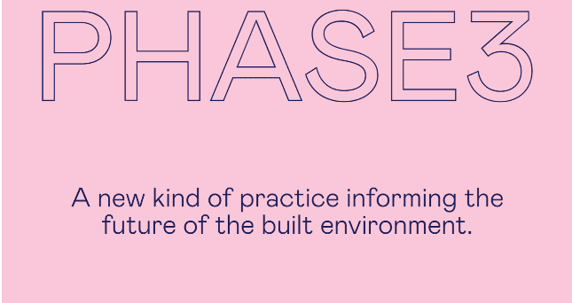
Hero areas, the part of a website when you first load the site, also known as the ‘above the fold’ area is a growing trend this year. The text-only trend is fascinating in a way that it removes the typical background image and simply allows typography to do the work.
The image above is a good example of stripping things back in the hero area and concentrating on typography alone. The typography has some personality on it also, rather than overused or standard sans-serif font.
3. Grids Dominating Trend

Invisible grids, which are designed in the majority of websites help keep page items organized and in-line. Nonetheless, this year, grids are becoming more dominant visually, and used as the main design aesthetic, inspired clearly by the renowned ‘card’ design trend.
Using the grid as a design aesthetic instead of just a design tool is popular among Web development service providers like Etatvasoft for developing great web designs for the clientele.
4. Vintage-inspired typography and colors
Bringing nostalgia back in web design as a throwback to previous times or things in the past is a growing trend today. This trend is influenced often by other forms of time media, such as TV and magazines, especially a throwback to the era where the internet does not exist yet. However, this year the trend is taking on a different form.
Rather than going all-in on a throwback or retro look, there are websites that take nostalgic pieces and bits, remixing them with contemporary styles. One of the most common design bits used in websites today is using typography and or vintage colors to convey a nostalgic feeling. Typography and/or vintage colors are one of the most common design bits inspiration used in websites today to convey a nostalgic feel.
Some websites also use vintage colors and typography to influence the design of their websites, while staying aesthetically modern.
5. Outlined typography design
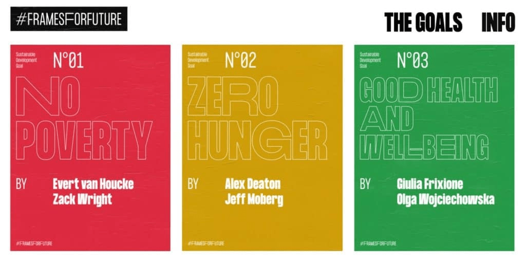
One of the big emerging trends in 2020 is the outlined typography design. There are more and more of this at present. Being distinctive typographically has become imperative on the web, which is terrific, considering that it was not long ago when designers have a handful of fonts only to work with.
Now, there are more web fonts that designers could choose from, more diverse, more daring. Designers could also use a big outlined font as part of their design aesthetic, combining animation for pulling out the ‘fill’ of the letters, leaving behind the outline only when scrolling down.
6. Black and white Web
Nowadays, many websites are doing experiments on having no color at all, and opting for the black and white design with nothing in between at all. The example illustrated above is a good example of an aesthetic design absence of color.
The above design focused on black and white primarily, with grayscale images. It looks crisp, clean, on-trend, and modern.
7. Geometric patterns and shapes design
Geometric lines, patterns, and shapes are coming back this year. One of the most attractive and appealing designs today are geometric patterns. They could appear in a huge range of styles and fulfill big roles.
The design, at its core, is based on shapes. Geometric shapes including circles, squares, triangles, rectangles, and so on combine to form beautiful and intricate patterns. Even if you use only a few shapes in your web design, there are a lot of possibilities as to what you could make.
8. Animations that are user-triggered design
When it comes to animations, customarily, we see them happening on their own, independent from any action that visitors could take on a web page. Nonetheless, this year a growing web design trend is animation triggered by the various actions and inputs of users.
9. Massive Font Size design
This is another typography-based trend. What’s going on now is typography that’s bigger than life, which could be seen and read from across the room. The image above is a perfect example of the growing trend. It takes the font size to very huge heights, taking almost half the home page’s viewport.
It features very huge typography, filling the viewport as a navigation style to help web visitors go to different areas of the site.
10. Color Schemes that are Trendy
Color combinations and schemes are familiar trends in other aspects of our lives, including social media, music, clothing, and more. Some of the color combinations this year are making their way into website design. An example of a trendy color combination includes a blue/dusty blush scheme, and primary pale pink that Instagram and Pinterest popularized.
Other examples of trendy colors include earthy tones, like browns, greens, tans, wood textures. There are also jewel tones, such as purples and greens. Also in trend are iridescent/pearl color schemes, with pastels that like liquid, pastels meld together for an almost metallic look.
Conclusion
Expect more web design trends that will continue to dominate screens this year to involve illustrations, typography, animations, mixed with new interactions and color schemes.
