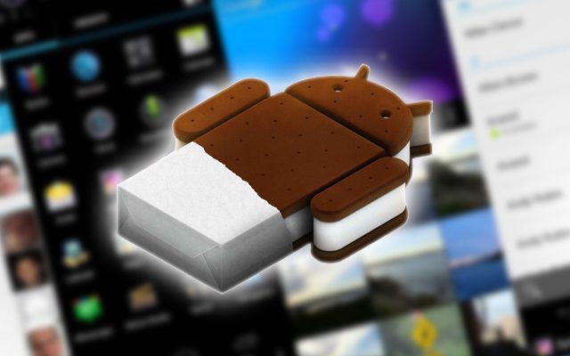
Google’s Android operating system is maturing by leaps and bounds with every new release, but the company’s 4.0 “Ice Cream Sandwich” version of the smartphone and tablet operating system is perhaps its most profound change to date.
The company focused extensively on usability and improvements to the operating system’s user interface; compared with its rough-around-the-edges predecessors, “Ice Cream Sandwich” feels like a polished, professional, and elegant mobile device platform. Given all of these big changes and overhauls, however, there are a few things that even the Android enthusiast should know and keep in mind.
Highlights of Contents
1. Your Android Device No Longer Requires Physical Buttons
It’s been a hallmark of Android-based smartphones since the very first one launched on T-Mobile several years ago: all Android phones had several physical buttons for navigation and selection. These included the home button, the back button, the menu button, and a scroll wheel or optical trackball. These buttons were required because there was no software equivalent: navigation was done only as a function of the hardware on which the Android operating system was installed.
With Android 4.0, Google has removed this limitation from its software and has given hardware manufacturers a new option when producing smartphones that run the company’s operating system. If enabled by the manufacturer, Android’s “Ice Cream Sandwich” iteration can display an app drawer button, a menu button, and a back button, as touch-based controls on the device’s screen.
This enables Android device makers to start creating button-free smartphone models that more closely resemble the sleek appearance of Google’s nearest competitor: the iPhone.
2. Tabbed Browsing Jumps from Desktop to Smartphone
Desktop browsers have long supported tabbed browsing, but the technology wasn’t available to Android users until this most recent software update. The Android mobile browser now supports up to 16 tabs open simultaneously, and these tabs can be closed or perused by swiping either left or right on the screen while browsing the internet.
Tabs can also be viewed as thumbnails, accessible via a menu option. This closely parallels to swipe-friendly “pages” available to users of Apple’s iPhone and the included Safari browser; it’s a welcome change that Android users have been asking for since the first iteration of the operating system.
3. Google Music is Integrated into Android
Apple’s iPhone has long been the darling of music lovers, as it is the only smartphone which successfully and seamlessly syncs with the company’s iTunes software. For avid users of the iTunes Music Store, this means an iPhone has been the only way to buy and listen to music both at home and on the go. That is no longer the case in Android 4.0 “Ice Cream Sandwich.”
Google recently launched its cloud-based music application and storefront, known as Google Music. With its most recent Android release, it has integrated Google Music into the operating system’s existing music player. It has paired this integration with a vast (and quite welcome) interface overhaul. Users will now find it exceedingly easy to buy, download, and sync their music between their Android devices and a desktop with access to Google Music.
4. New Contacts Application is Far More Useful — and Social
Before Android 4.0, the default “Contacts” application included with Android was rather basic, not very intuitive, and almost embarrassing. With the company’s latest software version, however, the app gets a complete overhaul that makes it one of the most beautiful — and functional — contacts applications on any mobile device. The company has made user pictures much larger — they now span the width of the screen.
And these large and beautiful user pictures are paired with social network integration. That means contacts’ pictures, addresses, and status updates now sync all-in-one without any third-party applications or hacks. Facebook and Twitter users can rejoice, as this integration is seamless, intuitive, and visually pleasing.
5. Enhanced Notifications are Easier to Use and More Informative
Google’s Android operating system has always been the leader in intuitive mobile notifications, but the company has managed to improve even this feature of the operating system. Notifications are now visible on the lock screen, and users can either swipe them and go to the relevant application, or swipe them a different direction to hide them from the screen.
Notifications now also have the ability to show a small and descriptive image on the left-hand side of the device, increasing their utility and functionality.
A Greatly Enhanced Platform
Google’s “Ice Cream Sandwich” release of Android is the most polished, professional, and elegant release to date. It’s easy to use, highly functional, and one of the most aesthetically pleasing smartphone operating systems ever produced by any software maker.
Author Bio: Evelyn C. is a freelance write and a proud mother of two teenage drivers. She is very familiar with the cell phone driving laws in her state and she discourages her children to use their cell phones while driving.

